Form Design Best Practices That Boost Completion
Most abandoned forms fail on design, not intent. These length, ordering, mobile, and accessibility rules are the cheapest conversion wins you will find.
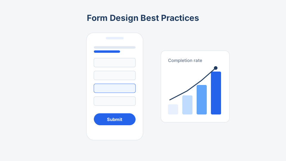
Nobody wakes up wanting to fill out a form. Every completed submission is someone tolerating friction long enough to get what they want — so completion rate is mostly a measure of how little friction you added. The good news: the fixes are boring, cheap, and repeatable. No redesign required.
These practices apply whether you publish a template from our library online or hand out the printed version.
1. Length: cut before you polish
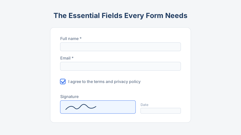
Field count is the single strongest lever you have. Before touching colors or fonts, run the audit from the essential fields every form needs and delete everything without a named consumer.
Then handle the length that remains honestly:
- Under ~8 fields: one page, no steps. A contact form or RSVP should never paginate.
- 8–20 fields: group into labeled steps (“Your details → Event choices → Confirmation”) with a progress indicator. The same fields feel shorter in chunks.
- 20+ fields: question the form itself. Split it into two forms at two moments — an event registration now, a preferences survey after — or use conditional logic so nobody sees questions that do not apply to them.
Conditional logic deserves emphasis: showing the “dietary requirements” block only to people who checked “attending dinner” shortens the form for everyone else at zero cost.
2. Ordering: easy first, scary last
People abandon at the first field that makes them think hard or feel exposed. Order accordingly:
- Start with momentum. Name and email are automatic — muscle memory carries people two fields deep before they evaluate the effort.
- Put the form’s purpose in the middle. Choices, dates, details — the questions people came to answer.
- Save sensitive or effortful fields for the end. Phone numbers, budgets, file uploads, long text. By then, sunk effort works in your favor.
- Group related fields under visible headings. A jump from “your address” to “emergency contact” and back to “postal code” reads as carelessness and erodes trust.
- One topic per screen in multi-step forms. Do not make step two a junk drawer.
The exception that proves the rule: on a booking form, lead with the date and time picker. Availability is the answer people came for — make them type a name first and they will check availability somewhere else.
3. Mobile: design for the thumb you cannot see
For most public forms, more than half of submissions come from phones. Design for that reality first:
| Rule | Why it matters |
|---|---|
| Single column, always | Multi-column layouts collapse unpredictably and break eye flow |
| Tap targets ≥ 44px | Checkboxes and radios at desktop sizes cause mis-taps and rage |
| Correct keyboard per field | email, tel, and numeric inputs summon the right keyboard — free speed |
| Enable autofill | Proper autocomplete attributes let phones fill name/email/address in one tap |
| Date pickers, not typed dates | Typing 2026-07-09 on a phone keyboard is punishment |
| No horizontal scrolling, ever | Wide tables and grids must reflow or die |
| Big, single submit button | Full-width, above the fold-fatigue zone, labeled with the action (“Reserve my spot”) |
Test on a real phone, on mobile data, before launch. The hosted form links on every template page here render mobile-first by default, but your custom fields and images can still break the layout.
4. Accessibility: the completion boost nobody markets
Accessible forms complete more often for everyone, because the same features that serve screen readers also serve tired people on small screens.
The non-negotiables:
- Every input has a real, always-visible label. Placeholder-only labels disappear on focus — the top accessibility failure in forms, and a usability failure too.
- Errors are specific, in text, next to the field. Red borders alone exclude colorblind users; “Something went wrong” at the top of the page excludes everyone’s patience.
- The form works with a keyboard alone. Tab order follows visual order; nothing requires hover or drag.
- Focus is visible. Users should always see which field is active.
- Contrast passes 4.5:1 for label and input text — thin gray-on-white labels fail people in sunlight, not just people with low vision.
- Required state is announced, in the label text (“required”), not conveyed only by an asterisk or color.
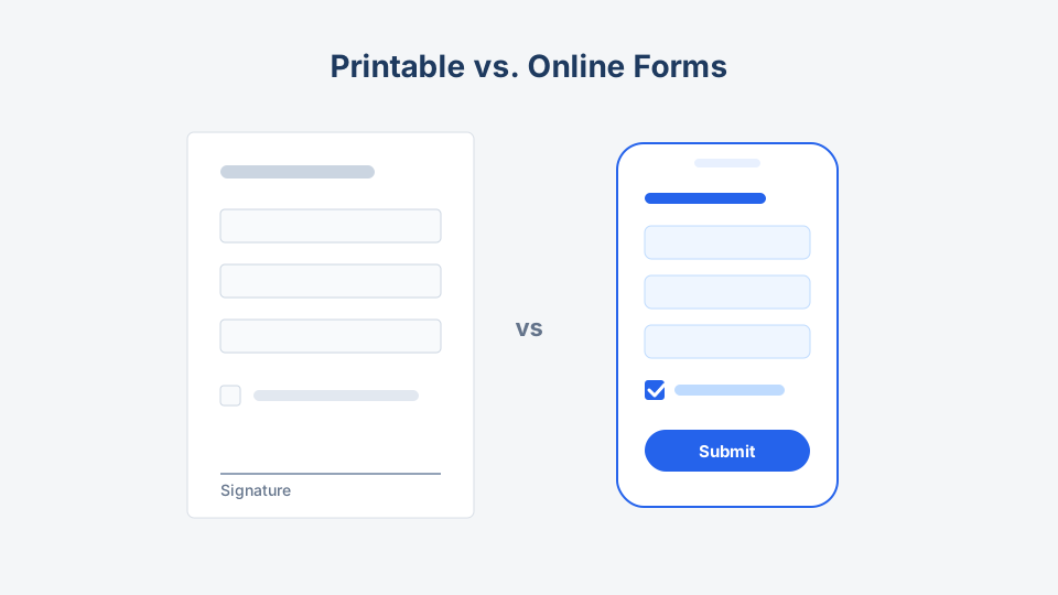
On printed forms, the same spirit applies: 12pt minimum text, generous boxes for handwriting, and instructions printed before the field they govern — more on print-specific layout in printable vs. online forms.
5. Trust: the invisible field
People abandon forms that feel risky. Three lines of copy fix most of it:
- Say what happens next. “We reply within one business day” under the submit button beats a generic thank-you page.
- Explain sensitive asks inline. “Phone — only used if there is a problem with your booking.”
- Show a privacy link before the personal fields, not just in the footer.
And after submission, confirm clearly: a confirmation screen plus an email receipt. A form that ends in silence gets resubmitted — now you have duplicates and an annoyed user.
Pre-launch checklist
- Every field passed the “named consumer” audit
- Under 8 fields on one page, or grouped into labeled steps with progress
- Easy fields first, sensitive fields last, related fields grouped
- Single column; tap targets 44px+; correct mobile keyboards; autofill enabled
- Visible labels, specific inline errors, keyboard-only pass completed
- Contrast checked; required fields announced in text
- Next-step promise under the submit button; confirmation screen and email live
- Tested on a real phone by someone who did not build the form
Key takeaway
Completion rate is designed, not wished for. Cut fields, order them from easy to effortful, build for thumbs, and keep the form usable without a mouse or perfect vision. Start from a template that already respects these rules — any registration or survey template here is a working baseline — then let the checklist above be the last thing you run before you hit publish.